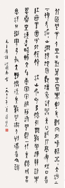
很多人都认为楷书是书法的基础,起码是行草书的基础,当然这种说法一直以来有争议,但不管怎么说,写好楷书确实是考验书法能否成家的一个标志,楷书难整,世人公认。那么,楷书怎么写才能达到比较高的水平呢?下面,山东收购名人字画教你如何写好楷书!
Many people believe that regular script is the basis of calligraphy, at least the basis of cursive script. Of course, this view has been controversial, but anyway, writing regular script is really a sign to test whether or not calligraphy can become a family. Regular script is difficult, and it is generally accepted by the world. Then, how to write regular scripts to achieve a higher level? Next, Shandong's acquisition of celebrity calligraphy and painting teaches you how to write good regular scripts!
1、写楷书要端庄平静而准立
1. Writing regular scripts should be dignified, calm and with a precise focus.
晋代书法家王羲之说:“凡是写字贵在平正安稳,是用笔的巧妙。有向下的笔势,也有向上的笔势。有倾向一边的笔画,也有歪而不正的笔画;还有斜着的;从整篇看,有小的字也有大的字。有(长)高一些的字;也有(短)矮一些的字。
Wang Xizhi, a calligrapher in the Jin Dynasty, said, "The first thing that matters is the cleverness of the pen. There are downward strokes and upward strokes. There are skewed strokes, skewed strokes, skewed strokes, small words and big words. There are (long) taller words; there are (short) shorter words.
唐代书法理论家孙过庭说:“初学书法,字体的笔画与字体章法的分布,但求既平安而又方正。”
Sun Guoting, a calligraphy theorist in the Tang Dynasty, said, "To learn calligraphy at first, the distribution of strokes and typefaces, but to be safe and correct."
明代书法家项穆说:“书法有三个要注意的地方:初学写字时要注意防止不均匀和倾斜,继续学下去后知道了写字的规矩,就要防止笔画与字体的不灵活或者出现呆滞现象。终学的熟练后,要防止任意的狂涂乱造的怪现象和不守规矩的俗气。
Xiangmu, a calligrapher in Ming Dynasty, said, "There are three points to be paid attention to in calligraphy: when you first learn to write, you should pay attention to preventing unevenness and inclination; when you know the rules of writing after you continue to learn, you should prevent the inflexibility of strokes and fonts or the phenomenon of dullness. After the final proficiency of learning, we should prevent arbitrary crazy phenomena and unruly vulgarity.

2、字体形象舒服而上下平稳
2. The font image is comfortable and smooth up and down
王羲之说:“写字的形象与气势不能上面宽而下面窄,如果这样重与轻显得不相配。字画和字间的空白布置应该远近均称,上下合适。自然就会平稳起来。
Wang Xizhi said: "Writing image and momentum can not be wide above and narrow below, if such emphasis and light does not match. The blank arrangement between the calligraphy and painting should be equally weighed far and near, and suitable for the upper and lower parts. Naturally it will stabilize.
唐代大书法家欧阳询说:“字的结构有上下两部分的,大多是(惟上重下)就是以上面为中心,而重在下面。上面轻的如头上顶戴着装饰物,如:叠、警、声之类的字就是代表。书论《八决》里所说的如:人体长得均称,上下比例协调。又不那么头轻尾重,头小尾大的。
Ouyang Xun, a great calligrapher of the Tang Dynasty, said, "The structure of the characters has two parts: the top and the bottom, most of which are centered on the above and the bottom. On the top of the light, such as wearing decorations on the head, such as: fold, police, voice and other words are representative. "Eight Decisions" in the book theory, such as: the human body is symmetrical in length, the upper and lower proportions are coordinated. It's not so light-headed and heavy-tailed. It's big-headed and small-tailed.
唐代书法家颜真卿说:“想写字先要预先心里想好字的形象,布置的笔画让它们平正稳妥,或者有意外生出的体势。令其有异样的美感才是巧妙的书法。”
Yan Zhenqing, a calligrapher in the Tang Dynasty, said, "If you want to write, you have to think about the image of the characters in advance, and arrange the strokes to make them smooth and steady, or have an unexpected body gesture. It is ingenious calligraphy that makes it have a different aesthetic feeling.
3、字的轻重要平衡,左右要均称
3. The balance between the importance and the lightness of words should be balanced.
欧阳询说:“开始学写字的人先要立意字的大体形象,横评竖直的安排。对于笔画之间的空白安排,务必均匀整齐。”
Ouyang Xun said, "Those who begin to learn to write should first set their mind on the general image of the characters and make a cross-examination of the vertical arrangement. For the blank arrangement between strokes, it is necessary to be even and tidy.
元代书法家陈绎曾说:“所有字的偏旁,都要让它们狭窄而长,这样右边就有余地了。在右边的也是这样。观察它们的轻重,使它们相符合而又相当为。就是说大小轻重很平衡美观。”
Chen Yi, a calligrapher of the Yuan Dynasty, once said, "All words should be narrow and long on the side, so that there is room on the right side. The same is true on the right. Observe their weight and make them consistent and reasonably good. That is to say, the size is balanced and beautiful.
以上是关于书法或者楷书的一些名言理论,主要说的是书法要上下贯气,通篇有着韵律。要用庄重的意态,刚直的性格去表现书法的整齐灵性美。以上说了这么多,你明白了吗?既然明白了,那还等什么?赶紧抄起笔写吧!
Above is some famous saying theory about calligraphy or regular script. The main point is that calligraphy should be coherent and rhythmic. We should show the neat spiritual beauty of calligraphy with solemn attitude and upright character. So much said above, do you understand? Now that I understand, what are we waiting for? Copy your pen now!
以上的精彩内容由山东收购名人字画教的小编整理所得,以上内容均来源于网络,假如大家由不同的意见,欢送大家到我们的官网:
http://www.jinandayatang.com!给我们留言评论,我们会定期给大家一个回复!
The above wonderful content is obtained from the small edition of Shandong's acquisition of celebrity calligraphy and painting teaching. The above content comes from the network. If you have different opinions, welcome you to our official website:
http://www.jinandayatang.com! Leave us a comment and we will give you a regular reply!
